Software Soul Searching
by Rob Foster
I believe the products we make have a soul.
But first, a case study.
Many years ago, I became frustrated by my inability to control my spending. My wife and I had gotten to where we had a small savings and our consumer debt was paid off. But we still found ourselves spending too much of each paycheck. I decided I had to figure out how to create a budget and stick with it.
Since it’s older than the hills, I knew about the Envelope Method. I figured it would be a good place to start, but I knew there was no way I was going to make trips to the bank to withdraw cash. It had to be something I could manage with my card and my iPhone.
One thing you should know about me is that I’m obsessed with finding the One True Way™ to do something. In the case of budgeting, I knew there had to be a system or method that worked better than any other. After more than a year of trial and error, I figured out a method that required the least effort and yielded the largest result. I also found an app that worked adequately with my method.
Since I’m me, I was never satisfied with the app I was using. It was designed for someone else’s method and was more than what I needed. I was also convinced that all the apps in the App Store were more than what most people need.
Desperately Seeking Software
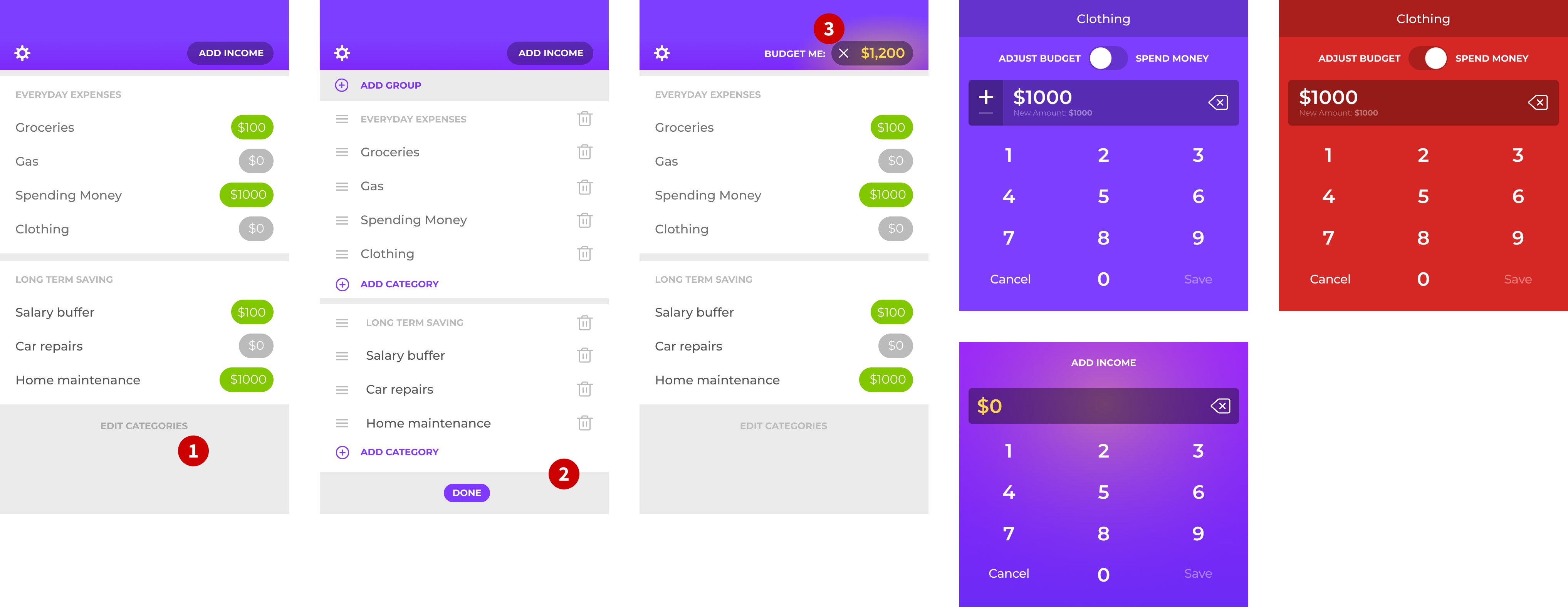
Over time, I became more frustrated with the app I was using. So I sat down and designed my ideal app. It looked like this:
Screenshot Notes:
- One of the first things I did was to start capturing and articulating the method that was working so well for me. Before I began designing the UI, I spent time thinking about the rules/principles that governed this method. Eventually, I would modify them but I knew that getting the method right was critical to the experience.
- My original style for the app was a cliché. I based it on currency guilloché because money. 🙄
- I knew from experience that this was a core design element of the app. The ability to have categories and category groups was essential.
- The plus button element at the bottom is an interesting case study. I stuck with it much too long. I’ll come back to that in a min.
- This “equation” UI is a perfect example of overthinking something. I was trying to show the before and after effect of a budget change but it’s completely overdesigned and unnecessary.
Once I got the designs fleshed out, I reached out to my business partner, Adam and pitched the idea. I walked him through the method and the app and I suggested we build it as a team.
Adam was not interested. He wasn’t into budgeting and so he wasn’t excited enough to work on it. I figured that was that.
The Inverted Tope Reversal
Almost a year went by and I got a call from Adam one day. He had questions about budgeting and wanted to know how I budgeted. He was dealing with the same overspending struggles I had. So I explained the method to him again and pitched the app once more. This time, it had the weight of context and he was 100% on board. So, of course, the first thing I did was start redesigning the app. I hadn’t looked at it in months and when I was walking through it with him, all kinds of issues were glaring to me.
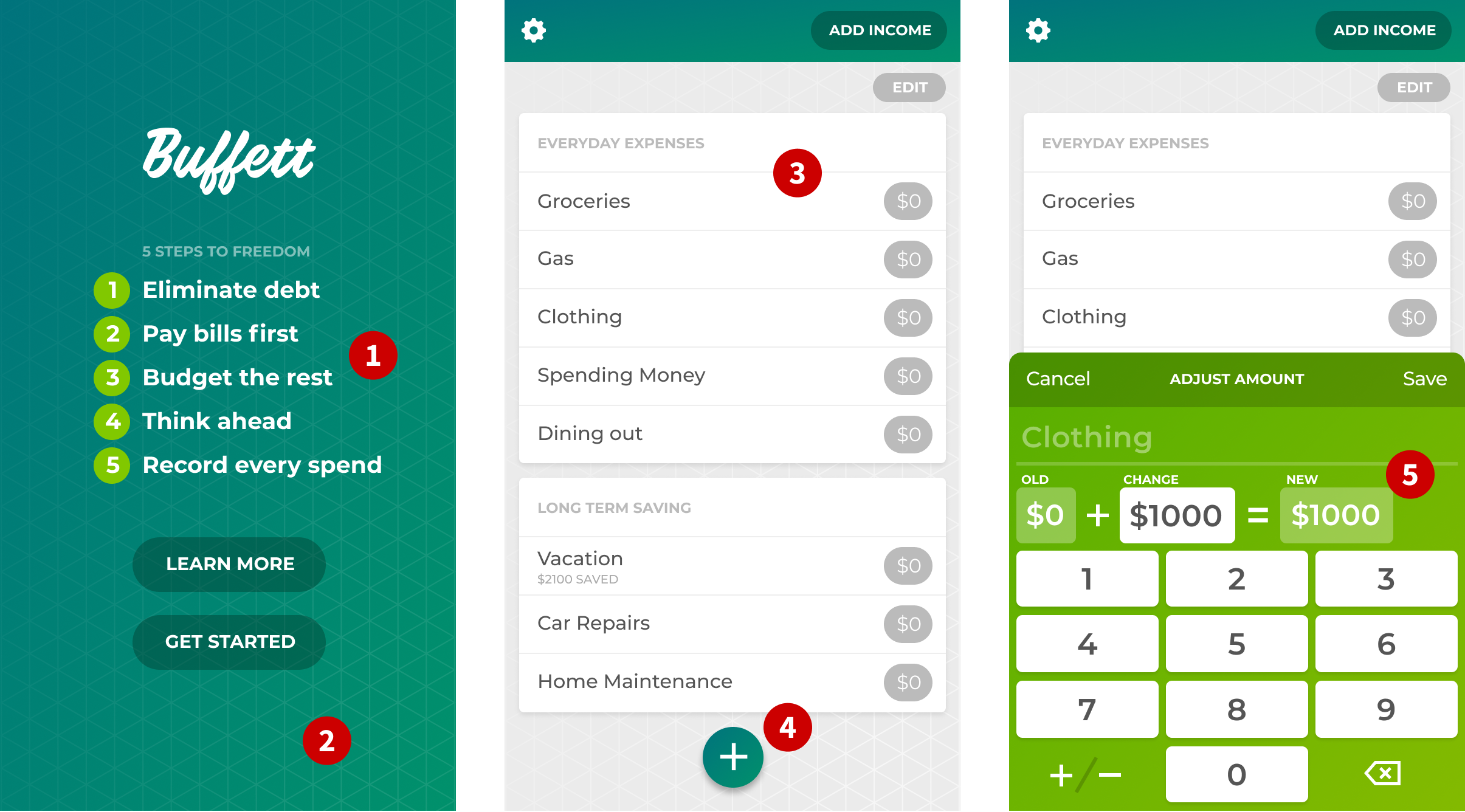
But before I talk about the many iterations we went through, I think it will help to explain how the app works.
Screenshot Notes:
- First, the user gets their “income” into the system so it can be budgeted. Starting with a total like this makes it so as people budget, they don’t have to do the math. Filthy Rich does that for them.
- This is the "Add Income" screen where the user adds that bulk income amount.
- The user then taps on each of the categories and moves money from the income to the category.
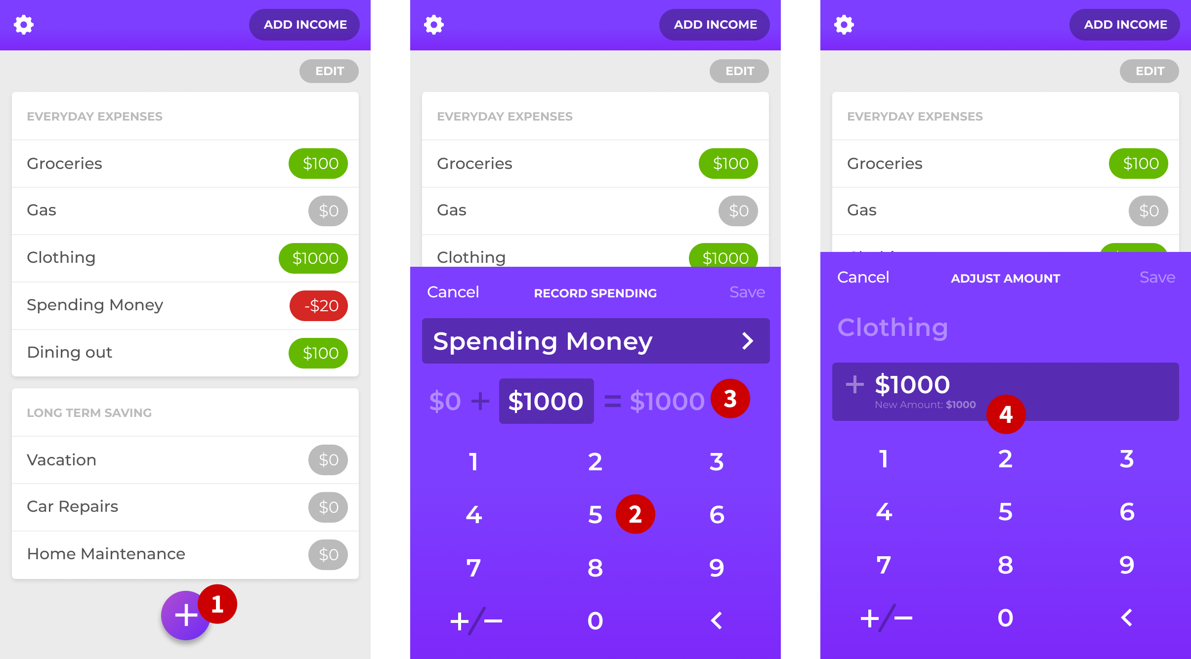
Screenshot Notes:
- This button invokes the screen to “track spending.” We also made a “long press” gesture on a category to automatically select that category. The “record spending” action is a key aspect of the Filthy Rich method. There are some budgeting apps like Mint and others that track spending for you. We have found that tracking spending is critical to getting spending under control. And it has to be done manually. You can’t turn it over to a machine.
- This was an unfortunate aspect of this design that I didn’t love. Even with the long-press, it seemed weird to have a big part of the UI devoted to something that should have been obvious. More on this in a minute.
- This shows two swipe gestures, one for transferring money and one for deleting a category. We changed the latter after some user testing.
ALLOW MYSELF TO INTRODUCE MYSELF
Looking at the design with fresh eyes, I could see that the signal-to-noise ratio was off. I realized I didn’t need as much UI chrome as I thought. It was also obvious to me how tired and cliché the style looked. I needed to find a brand and UI aesthetic that was more in harmony with the goals and vision I had for the app.
One thing I knew for sure was that a key to the app was in the fluidity and ease of capturing spending. I also wanted the brand to have more personality. I needed to find the true essence of the app. I needed to find its soul.
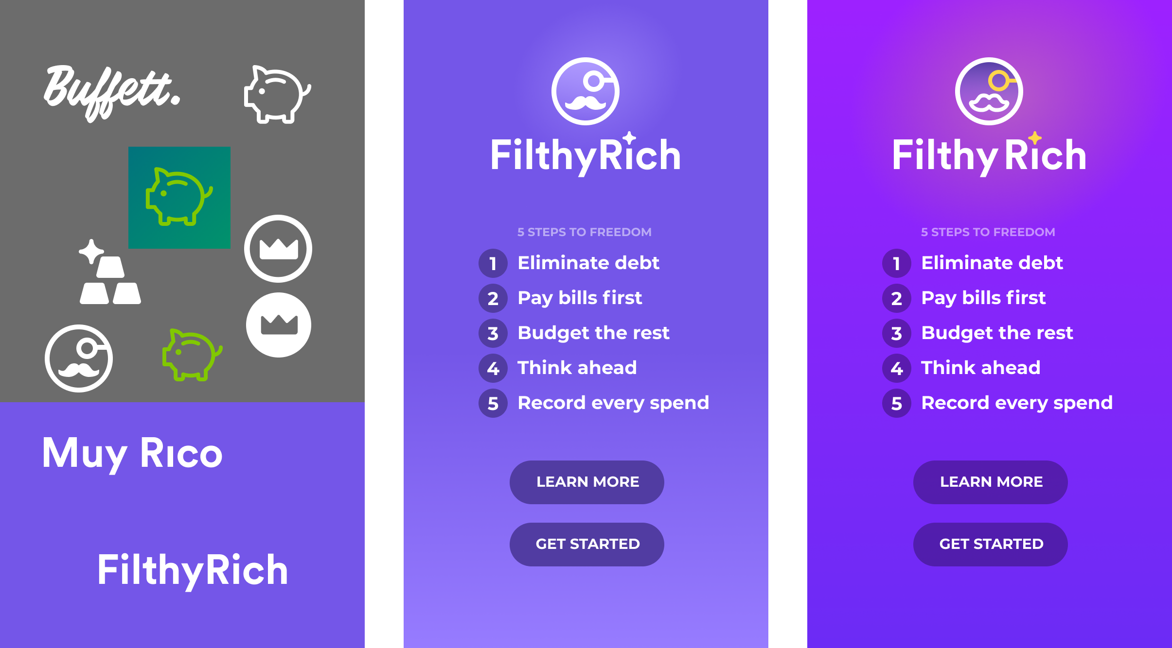
As I started working on the brand identity, I played with other symbols of wealth. I explored royal imagery and found I liked using a royal purple as the core color. I don’t see very many purple apps and thought it might stand out in a sea of blue.
Using an obvious royal symbol like a crown wasn’t working. Instead, I explored going over-the-top with some bourgeoisie imagery. I designed a monocled, mustachioed “rich guy” icon instead and immediately loved it. I also landed on the name “FilthyRich” which further pushed the theme of upper-class absurdity. I also liked that the name focused on the aspirational state of the customer. Even if the identity is absurd, we still want to help people build wealth and financial security. So being aspirational in name seemed right to me. We went back-and-forth a few times on whether the name should be two separate words or smashed together. In testing the smashed version, we found problems with Siri. So we were forced to use a two-word name. But in the logo, I reduced the space between the words so that it almost looks like one word.
As I played with color, I also looked for ways to make it feel even richer and more saturated. I added a splash of gold, which really made it shine. I loved the idea of an ostentatious brand with a laser-focused, almost austere UI. So I started focusing on the UI next.
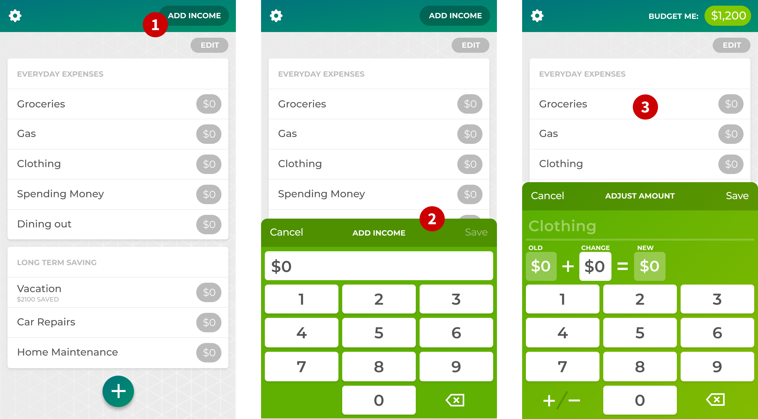
Let’s get down to the nitty-gritty
This was the start of an obsessive degree of removing the unessential. We always try to do this in our apps, but with Filthy Rich, we definitely became more aware of it than ever. Every time we removed or simplified something, it made the app that much better.
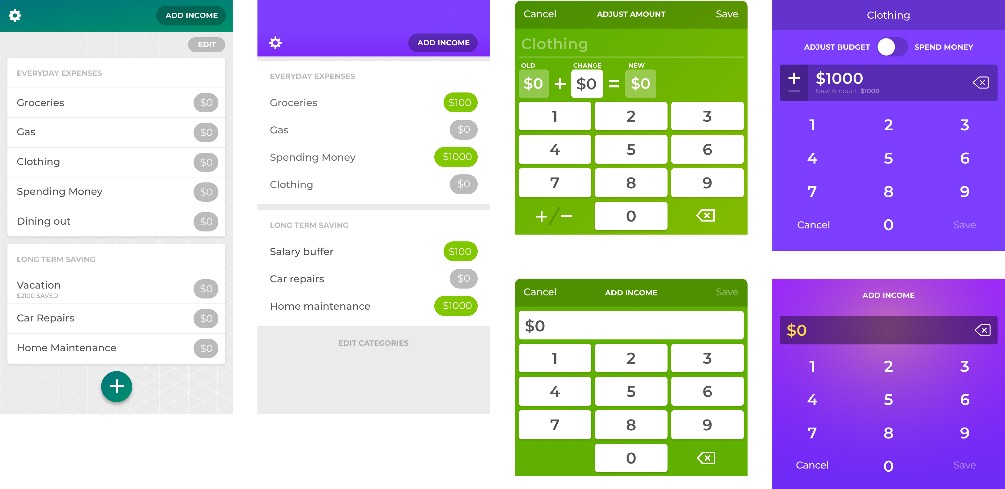
Screenshot Notes:
- You can see that the “record spend” button is still here in this iteration.
- Selecting all the button shapes and deleting them in my design app was deeply satisfying. Numbers on their own worked well enough.
- I brought over the “equation” UI but after removing the number button chrome, it was clear that this was too complex.
- Instead of the equation, adding “new amount” under the field amount accomplished the same goal. It let people see the result of the adjustment they were making, but without all the extra chrome.
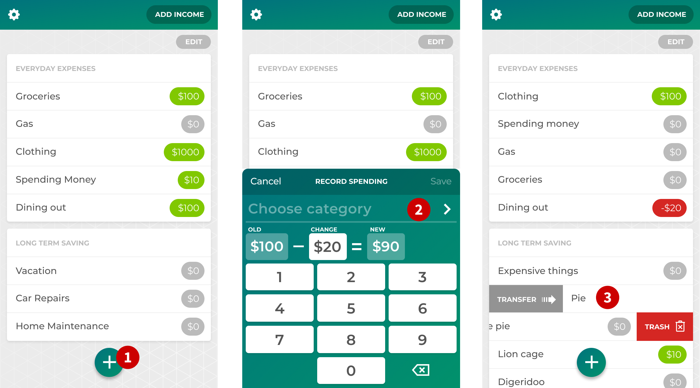
Screenshot Notes:
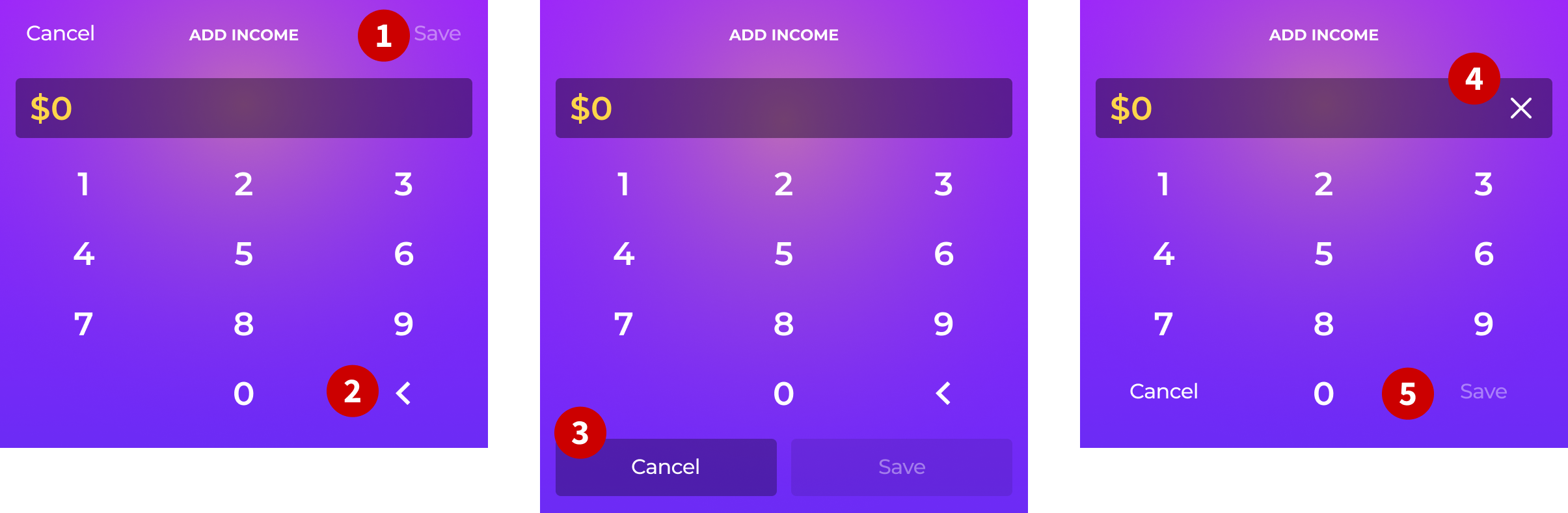
- I created a clickable prototype to start doing user testing with the new designs. You can see a newer version of the prototype I used here. I found that even though it was standard practice in iOS to have the save/cancel buttons at the top of the UI, people were still looking for them at the bottom.
- Here I started playing with using a simpler “caret” style for the backspace action. More on this later.
- I moved the save and cancel buttons to the bottom but it increased the ratio of noise-to-signal.
- I played with using a single “delete” function instead of a backspace. But wiping out the number and making them start over had the effect of throwing them off their flow.
- Moving the backspace up into the field freed up space in the keypad for the save and cancel buttons. This tested well.
Screenshot Notes:
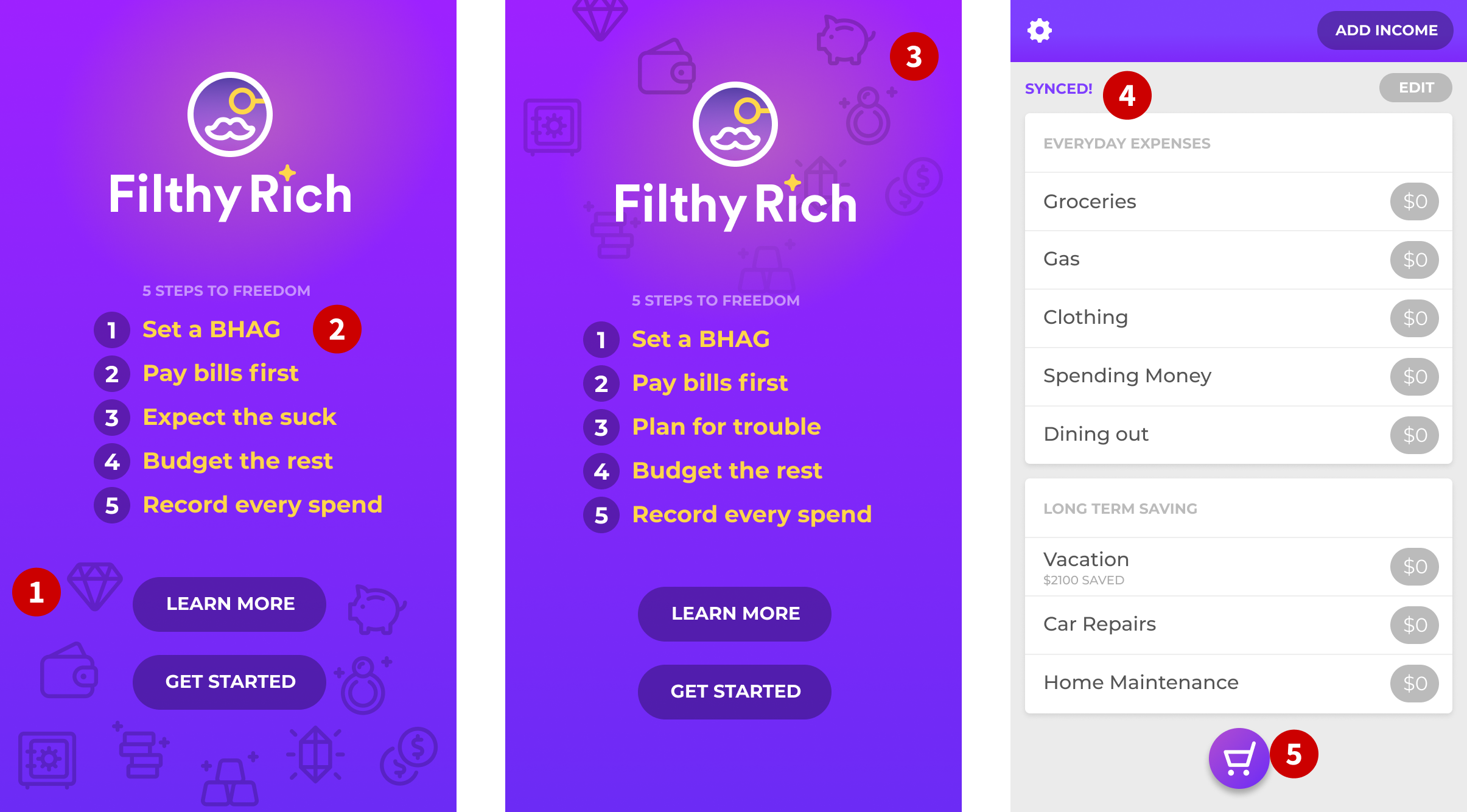
- As I began to design the settings screens (not covered in this article), I added some illustrations. To complement them, I also added some icons in the same style to the home/intro screen.
- We continued to refine the 5 points of the budgeting method. Before, the first item was “eliminate debt.” We found that while very important, debt elimination was a whole other discipline. The focus of Filthy Rich needed to stay on budgeting. Adam also made a pitch for replacing that section with a section around goal setting. I realized that goal setting was part of my process but that I had never really articulated it. So we added, “Set a BHAG” which I later changed (as you’ll see).
- I wanted to continue refining the eggagerated branding. So I asked Adam if we could “make it rain” with the icons and move them to the top. He was enthusiastic in adding this completely superfluous animation.
- We’ve gone back and forth on adding a note that lets the user know when a sync is complete. This was one iteration of how that might work. It would be a small message that would appear and then fade out over a couple of seconds. We will likely add this at some point but probably in a different location in the UI.
- The “record spend” button (I need a better name for this vestigial button) is still here. As I performed user testing, it was clear that the plus button
 I had before was super confusing. In hindsight, I feel dumb for not picking a different icon. I would learn later that this new “shopping” icon didn’t address what was a more fundamental issue.
A designer and a developer walk into a bar
I’m not the kind of designer that is protective about the role of design. If I had my way, everyone on a software team would be design-minded. Heck, everyone in any company should be a designer. The more design thinking in an organization, the better. The more focus on the customer experience, the better. So it’s always unsurprising for me when some of the best UX solutions come from developers. Adam is one of those developers. He cares deeply about the customer experience. He has told me on many occasions that he doesn’t care about time spent refactoring UI. That it’s as important as any other work.
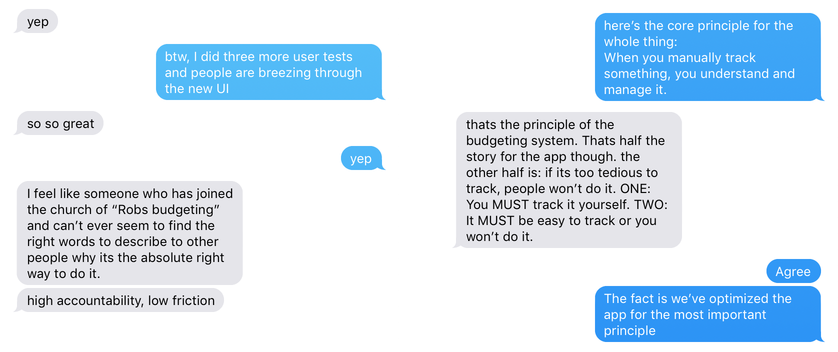
So one day Adam approached me with the solution that fixed the weirdness in the user testing that I was seeing. It also eliminated the need to even have the plus button for recording a spend. Here’s a screenshot of our exchange and my resulting design, based on his idea:
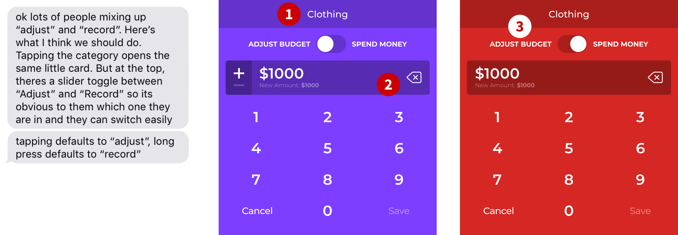
Screenshot Notes:
- One of the best things about this new UI is it completely eliminated the need to ever pick a category for the two most common actions. This was a breath of fresh air.
- The left caret/arrow I had before was confusing. Some people thought it was going to slide the UI left somehow. People thought it meant something other than “backspace.” So I replaced it with the standard iOS backspace icon and the problems disappeared.
- I added a not very subtle color shift that really helped guide the user in testing. I also like to think that it has a small psychological effect. Perhaps the red makes spending feel like a negative thing and will help curb overspending.
A note about user testing: I’m a gregarious person and don’t mind approaching people in public places and asking for their help. For Filthy Rich, I did a fair amount of testing with friends and family. But I also went to local stores and petitioned total strangers for their help. Everyone I met was super friendly and helpful. I love living in a small town.
The following is the text exchange I had with Adam the next day after testing a clickable prototype of the new UI:
Wherein I get to the point
Products have a soul. Naturally, I don't mean this in a metaphysical way. I mean it in a practical way.
Products reflect the attitudes and values of those that create them.
Sometimes those values are obvious, sometimes not. Sometimes the values are intentional and sometimes they are subconscious. But they’re always there.
As we’ve built Filthy Rich, I’ve come to a realization. Adam and I always design and build things with solid values or principles in mind. But we rarely articulate them and refine them the way we have with this app.
In writing this article, I’ve realized just how much my latest thinking about UX has influenced my design choices. I’ve also realized how great it is that after many years of doing this, there’s always more to learn.
The following are the core values that drive the development of Filthy Rich, in no particular order.
- It’s important to design opinionated software. Making your software so the user can configure it how they want is usually a mistake. Instead, put in the time to experiment with different approaches. Find the design that works best for most people.
- Keep removing elements from your design until you have only the most essential. You’ll be surprised by what you can do without.
- The first principle, specific to Filthy Rich is that you can’t automate budgeting. The act of recording what you spend is the magic key to helping you get a handle on your spending. There are apps that connect to your bank account and show you what you’ve spent. But automatic tracking isn’t as powerful for changing behavior.
- Manual tracking is critical. So it’s also critical to make the tracking process as easy and painless as possible. This is one of the main reasons we’ve removed so much noise from the app. If we remove any barriers to manual tracking, then it can become a habit.
- User testing is absolutely essential.
After and before and after
Here are a couple more screenshots and notes. These are the designs that we’re shipping for version one, as well as some before and after screens.
Screenshot Notes:
- The edit button occupied a location that was too prominent. So I moved it to the bottom and de-emphasized it by making it a text link without any button chrome. Also, you’ll notice that we removed the lines between the categories. This is another example of how you can remove something and make the experience better.
- This is the first time in this article that I’m showing how we handle the editing of categories.
- I added a way for people to be able to clear the income and start over if they fat-fingered the amount. I didn’t need to do testing on this since I did it myself a few times. This is one of many advantages of being a daily user of your own software.
The end
This was a long read. I hope it was valuable to designers and others who are interested in the process of software design. And of course, we’re not done with the app. Heck, we’re just getting started. But we’re also proud of what we’ve built so far.
I don’t know if Filthy Rich will be a financial success or not. But it also doesn’t keep me up at night. Building it was a labor of love. We built it for us but we also designed it to benefit others. Being financially in control has a material impact on peoples’ quality of life. We hope people get as much benefit from budgeting as we have. We also hope to inspire those who design and build software. Think about the values you impart to your work. Consider the soul of your software.
✌️
